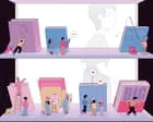
From cover design to shelf placement and influencer partnerships … how publishers will persuade you to buy their books this autumn
Think about the last book you bought. How did you choose it? Was it from a recommendation, a review, a TikTok video? Did the cover grab you, were you swayed by the quotes on the front, or did you just happen to spot it on an appealing table as you walked into the shop? Did you think about all the nudges that led you to that decision – by the publisher, the bookseller or that person you follow on Insta?
The reality is that our reading choices are directed and massaged at every turn. “It’s all about the art of persuasion,” says Philip Gwyn Jones, who was a publisher for more than 30 years and is now a literary agent. And who are the persuaders? They’re the booksellers, the supermarket stock buyers, the publishing houses and their ranks of marketers and publicists. And, more recently, persuasion often comes from BookTokers and online influencers, social media videos, podcasts and Instagram posts. How is all this changing publishing?
We all judge books to some extent by their covers, but did you know how much thought goes into finding just the right cover, colour, font and design? These covers are focus-grouped, shown to supermarket buyers and often changed at their behest, according to Jamie Keenan, one of Britain’s leading book designers. “That happens quite a lot,” he says. “If Tesco with commercial books, or Waterstones with literary stuff, don’t like it, they’ve got a tremendous amount of clout.” (Waterstones and Tesco declined to speak to me for this piece.)
Meanwhile, online browsing and buying have brought about big changes. “There’s been a move towards more iconic book covers because of thumbnail images [on apps and websites],” Keenan explains. “One very simple emblem or logo that you can see from a distance, even when it’s two inches tall. Nice bright colours and big type,” he adds. “That’s what publishers are doing to attract people’s attention.”
It’s true: when I went into Waterstones last week, I felt like reaching for my sunglasses to shield the glare of garish, saturated colours screaming from the fiction shelves: more sweet shop than book store. When I shared a photo on Instagram, a number of authors messaged me. “I hate it,” said one (whose own latest novel has a brightly coloured cover). “It’s just so brash.” Yet ironically, because all these books look the same, the effect is to make them blend in, not stand out. “Jewel tones have the industry in a headlock,” messaged another.
And then there are the increasing numbers of copycat covers, so that every cosy crime novel suddenly looks like Richard Osman’s bestsellers – cream background, coloured border, hand-lettering – and all heartwarming Japanese books have to feature a cat. (At his last publishing house, says Gwyn Jones, for Japanese fiction “there was this unspoken imperative to put a cat on the cover even if there wasn’t a major role for a cat in the book. It did seem to make a difference.”) “You quite often get briefs on what are called comparable titles,” Keenan says. “That’s a nod-and-a-wink way of saying, ‘Can you do something that looks a bit like these three?’”
After the cover does its trick, we read the publisher’s description on the back. That’s the work of copywriters. “The cover designer has got them to pick up the book,” says a copywriter for a major commercial publisher. “It’s my job to make sure they don’t put it down again.”
The blurb is how we decide if this book is one for us. “You’ve got seconds to grab people,” says the copywriter. One of their tricks is to use Christopher Booker’s book The Seven Basic Plots. “Most stories can fit into three or four of Booker’s categories: The Quest, Overcoming the Monster and so on. It gives you tools to tell the story of the book in different ways. You want to say: ‘It’s the same but different.’”
What if an author isn’t writing what’s on trend right now? “For the best part of two decades,” the copywriter says, “we had Scandi noir: very dark, psychological thrillers. Now cosy crime is absolutely everything. If a writer is still writing noir and wants their books to be in the supermarkets, it needs to look like the books that are selling in supermarkets.” That means “you’ll find books being packaged rather differently to how they [really] are”. These cosy crime blurbs need to, frankly, make death and violence sound like a minor inconvenience, so they focus on the mystery aspect (the books are “ingenious”, full of “twists and turns”) or the welcoming narrative tone (“delicious’” and “delightful”) or the sense of tradition they follow as “quintessentially British” stories. But “publishers are lemmings,” the copywriter says, “and that’s where the market is.”
“There has been a sense since the mid-2000s that popular fiction readers’ tastes have narrowed,” they continue, “following one or two big trends. That parallels [the rise of] social media. Romantasy and cosy crime are the main areas of current growth.”
Whatever the genre, “a blurb has to tell a little story,” says Louise Willder, another copywriter, and author of a book on the subject, Blurb Your Enthusiasm. But, “we’re aware not every word we write will get read.” That’s because, explains the commercial copywriter, “People read in an ‘F’ [shape] – they’ll read across the top and then they won’t read the next line, they’ll just drop down to the next paragraph. So you’re trying to hit your marks at the start of each paragraph.” Cliches have always been rampant, they just shift with time. So “witty” becomes “whip-smart”. “It’s never ‘moving’, it has to be ‘deeply moving’,” says Willder.
Publishers’ blurbs aren’t the only thing on book covers; they are also clogged with endorsements from fellow authors. According to Willder, “audiences say they’re mistrustful” of these. There’s a sense that they are favours for friends – which may be justified. When it comes to quotes, “networking is crucial” confirms the commercial copywriter. “I’ll try to get two or three endorsements from my circles, or the author’s circles,” adds Gwyn Jones.
Author endorsements are, in any event, more often aimed at booksellers than readers. Even though many books are now sold online, the visibility of books in shops remains crucial to their success. Although some names may offer more effective badging than others – certain authors “seem to pop up on every single book”, says Brett Wolstencroft, manager at independent chain Daunt Books. “Stephen King has endorsed so many people,” says the commercial copywriter. “Tony Parsons is another culprit.”
Not all booksellers need to be persuaded, it should be said – some need to be paid. One experienced publicist I spoke to said: “To get books into supermarkets, you have to pay quite a lot of money. The general public thinks that those top 10s are earned positions and they are very much not earned positions. They’re paid for.” This practice used to be widespread. TG Jones, formerly WH Smith, also charged publishers for chart space, according to a 2022 BBC report, though the chain said that sales performance was also a factor. And in the time before James Daunt took over, Waterstones charged publishers to put their books on display tables. But now, one Waterstones bookseller tells me, “everything is down to individual booksellers”.