With air and sea surface temperatures already breaking records, this year’s episode is on track to be the strongest in living memory.
This year’s El Niño is already intense, and it’s not done growing. Scientists expect that by December, when El Niño events typically reach their peak, this one will wind up as the strongest in at least 80 years of precise record keeping. And perhaps as the most powerful in centuries.
The event will alter weather patterns across the planet and could drive an additional 49 million people into hunger, according to a projection by the United Nations’ World Food Program. It will also temporarily boost global temperatures that were already rising because of climate change.
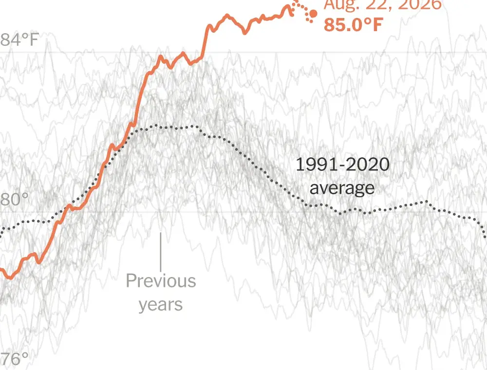
Here are three charts that show the power of this El Niño.
Notes: Chart shows sea surface temperature anomaly in the region where El Niño is detected compared to a 1991-2020 average baseline. The shaded area represents the 25th and 75th percentile bounds. Source: Observed NOAA data and multi-model median forecast via The Climate Brink. The New York Times
El Niños are essentially anomalies in the tropical Pacific Ocean. Their magnitude is measured by how far temperatures there rise beyond the norm. Temperatures must jump 2 degrees Celsius (3.6 degrees Fahrenheit) above average to qualify as a Super El Niño. But this year’s event is expected to go even further, well exceeding the prior strong El Niños that began in 1997, 2015 and 2023.
It’s unusual to have three strong El Niños in 11 years. And scientists are divided about whether that run is just a coincidence, or whether climate change might be making El Niño events more frequent and intense.
Note: The chart shows average sea surface temperatures in the region where El Niño is detected. The data from Aug. 8–22, 2026, are preliminary. Source: Climate Reanalyzer. The New York Times
Note: The chart shows global average surface air temperatures. Source: Copernicus. The New York Times
We are having trouble retrieving the article content.
Please enable JavaScript in your browser settings.
Thank you for your patience while we verify access.